【CSS】flexboxで子要素、孫要素の高さをそろえる方法

flexコンテナの子要素の高さをそろえることはcssのflexレイアウトでデフォルトで可能すが、テキストエリアなどの孫要素の高さは対応をしなければ以下の様にバラバラになってしまいます。
height.jsなどjsを使用することで対応できますが動作が重くなりパフォーマンス低下の恐れがあります。
今回はflexコンテナの孫要素の高さをcssでそろえる方法の覚書になります。
flexboxの子要素の設定
まず flexコンテナの子要素(.flex-card)に
display: flex;
flex-direction: column;
を設定します。
display: flex;にすることで要素が横並びになってしまうので flex-direction: column; にすることで要素を縦積みにします。
.wrap-flex .flex-card {
    width: 31%;
    background: #000000;
    padding: 20px;
    font-size: 120%;
    font-weight: bold;
    display: flex;
    flex-direction: column;
}
flexboxの孫要素の設定
高さを合わせたい要素に
flex-grow: 1;
を設定することで2段目の余っているエリアを自動的に決定します。
.flex-card .flex-text {
    flex-grow: 1;
}
サンプル
こちらが実際のデモになります。
SVGモーフィングでjs/css無しアニメーション-モーショングラフィックス講座
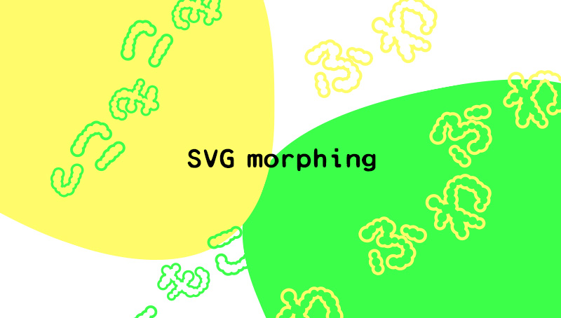
SVGモーフィングとはベクターデータで作成された複数の図形を流動的に変化させるアニメーションです。
webデザインで使用すると背景アニメーションやローディングアニメーション、内容強調などで効果的に表現できます。
しかも実装はcssやjsを使用せずタグ内でアニメーションの設定をするだけです。
アニメーションするSVG画像を作成する
まずアニメーションするベクターデータを作成します。
今回はわかりやすくSVG1とSVG2として流体シェイプ を2種類作って2点間をモーフィングさせます。
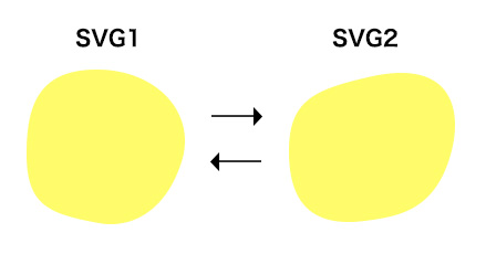
※流体シェイプはillustratorで正円のアンカーとハンドルを適宜変更することで簡単に作成できます。
できた図形を別名保存でファイルの種類をSVGに設定し、保存ボタンを押します。その後のSVGオプション画面が開くのでSVGコードボタンを押します。
パス情報をアニメーションで使用しますので今回の2図形文用意します。

SVGを動かしてみる
pathタグとanimateタグのvaluesに上記のパス情報を使用します。
<svg xmlns="http://www.w3.org/2000/svg" width="300" height="300" viewBox="0 0 200 200">
<path fill="#000000" d="M170,110c-15,46.5-47,60-74,55c-45.9-8.5-65-16.3-65-63s13-76,63-76C148,26,184.3,65.6,170,110z">
<animate
    attributeName="d"
    dur="2s"
    repeatCount="indefinite"
    values="M170,110c-15,46.5-47,60-74,55c-45.9-8.5-65-16.3-65-63s13-76,63-76C148,26,184.3,65.6,170,110z;                          M170,110c-15,46.5-46.8,51.2-74,55c-50,7-70-16.3-70-63s24.3-55.8,73-67C173,18,184.3,65.6,170,110z;
            M170,110c-15,46.5-47,60-74,55c-45.9-8.5-65-16.3-65-63s13-76,63-76C148,26,184.3,65.6,170,110z"/>
<animate
    attributeName="fill"
    dur="2s"
    repeatCount="indefinite"
    values="#2cff85;
            #1eb287;
            #2cff85;"/>
</path>
</svg>
<animate attributeName="d"で形状を、<animate attributeName="fill"で色を変化させてます。都度 <animate>を設定します。
attributeName アニメーションの対象となる属性名 dur アニメーションする時間 repeatCount アニメーションがリピートする回数。indefiniteだと無限 values attributeNameに対する値。dならばパス、fillならばカラー16進数 calcMode 値の変化。discrete(急激に)linear(一定に)など
サンプル
縦横斜めに動く簡単パララックスLuxy.js

今回はVanilla JavascriptのパララックスプラグインLuxy.jsをご紹介します。
普通パララックス効果って縦か横のイメージでしたが簡単なタグの属性設定で斜めにも動けることが発覚しました!
設定はjqueryに依存しないうえに3行コピペでOKのシンプルさです。
Luxy.jsの基本的な設定
公式サイト:Luxy.js
GitHubより「Code」ボタンから「DownloadZip」を選択します。
luxy.js-master¥dist¥jsフォルダにあるluxy.jsを使用します。
読み込み
以下のように読み込み設定をします。
パララックスしたい範囲をid luxyで指定し、実際にパララックスアニメーションで動かしたい要素にクラスluxy-elを付与します。
wrapperSpeedは慣性スクロールの速度です。「1」を基準に数値が少ないほど遅延効果が大きくなります。個人的には使いにくいので地味に0.9に設定しました。
<script src="js/luxy.js"></script>
<script>
    luxy.init({
        wrapper: '#luxy',
        targets : '.luxy-el',
        wrapperSpeed:  0.9
    });
</script>
HTMLの記述
luxyの中にパララックス要素としてluxy-elを設定するのみです。
    <div id="luxy"><!-- ←パララックス範囲 -->
            <div class="luxy-el"><!-- ←パララックスしたい要素 -->
                    <h1 class="center">TEXT</h1>
            </div>
    </div><!-- //luxy -->
パララックス効果の速度や方向の設定
視差効果の速度の設定
タグの属性にdata-speed-yを設定します。
後述する横方向のアニメーション時には data-speed-xを設定します。
<div class="luxy-el" data-speed-y="6">
        <div class="inner">
                <h1 class="center">SPEED-6</h1>
        </div>
</div><!-- //luxy-el -->
水平方向に移動
水平方向に移動する場合は、data-horizontal = "1"を設定し、data-speed-xを使用して水平方向の速度を指定します。
<div class="luxy-el" data-horizontal="1" data-speed-y="6" data-speed-x="6">
    <h1 class="center">horizontal-斜め</h1>
</div><!-- //luxy-el -->
オフセット設定
data-offset属性でオフセットを指定します。
<div class="luxy-el" data-speed-y="2" data-offset="-100">
    <h1 class="center">data-offset</h1>
</div><!-- //luxy-el -->
ななめに動かす
data-horizontal="1"、data-speed-y="6"、data-speed-x="6"の3つの属性を設定することで斜めにも移動することができます。
<div class="luxy-el" data-horizontal="1" data-speed-y="6" data-speed-x="6">
        <h1 class="center">horizontal-斜め</h1>
</div><!-- //luxy-el -->
Luxyサンプル
data-horizontal="1" data-speed-y="6"の組み合わせでデモ冒頭のようなflexで整列させたテキストが広がるアニメーションのような表現も可能です。
See the Pen Luxy.js demo by uhaha (@uhaha) on CodePen.

最近のパララックス設定はほんとに簡単になりました。いろんな組み合わせでさまざまなアニメーションが作成できそうですね。
超有名スライダープラグインslickのエンドロール的な使い方とプログレスバーのカスタムについて

今更感があってなかなか記事にできなかったslickですが、なんだかんで使いやすく応用しやすいので役立ちそうな内容に絞ってまとめてみました。
- slickの基本的な設定
- slickでエンドロールのように滑らかにスライドさせる
- slickに進捗プログレスバー付きスライダーにする
- slickの各スライダーのdotsをプログレスバーにする
- サンプル
- まとめ
slickの基本的な設定
読み込み
以下よりslickのソースをダウンロードします。
公式サイト:slick-carousel
ダウンロードした中身はこんな感じです。

jQuery依存なのでjquery-3.5.1.min.jsも読み込みます。
slickとして読み込むファイルはslick.css、slick-theme.css、slick.js (slick.min.js)になります。
<script src="js/jquery-3.5.1.min.js"></script>
<!-- slick -->
<link href="css/slick.css" rel="stylesheet" type="text/css">
<link href="css/slick-theme.css" rel="stylesheet" type="text/css">
<script src="js/slick.min.js"></script>
基本的な設定をする

slick基本形として上記のような簡単なスライドを作成します。
スライダーにしたい親要素にslick.jsで使うクラスslide_demo01を設定し、子要素が実際にスライドする部分になります。
<ul class="slide_demo01 wrap_list">
    <li><img src="https://uhaha.net/wp-content/uploads/2021/10/img01.jpg" alt=""></li>
    <li><img src="https://uhaha.net/wp-content/uploads/2021/10/img02.jpg" alt=""></li>
    <li><img src="https://uhaha.net/wp-content/uploads/2021/10/img03.jpg" alt=""></li>
    <li><img src="https://uhaha.net/wp-content/uploads/2021/10/img04.jpg" alt=""></li>
    <li><img src="https://uhaha.net/wp-content/uploads/2021/10/img05.jpg" alt=""></li>
    <li><img src="https://uhaha.net/wp-content/uploads/2021/10/img01.jpg" alt=""></li>
    <li><img src="https://uhaha.net/wp-content/uploads/2021/10/img02.jpg" alt=""></li>
    <li><img src="https://uhaha.net/wp-content/uploads/2021/10/img03.jpg" alt=""></li>
</ul>
slickのオプションは以下の様に設定します。
<script type="text/javascript">
$(document).ready(function(){
    $('.slide_demo01').slick({
        arrows: true,//next、prevの矢印の表示
        dots : true,//ドットの表示
        autoplay: true//自動再生
    });
});
</script>slick-theme.css内でローディング画像のajax-loader.gifを設定しているので使用する場合は適宜調整します。
slickでエンドロールのように滑らかにスライドさせる
カルーセル表示で、映画のエンドロールの様に滑らかに左右や上下にスライドさせる方法です。
通常の設定からオプションを少し変更するのみで簡単にできます。
autoplaySpeed: 0にして制止する時間を無くします。
イージングもcssEase: 'linear'とし調整します。
    $(document).ready(function(){
        $('.slide_demo02').slick({
            arrows: false,
            autoplay: true,
            autoplaySpeed: 0,//制止するスピード
            speed: 5000,//移動する時間
            cssEase: 'linear',//イージングで均一を設定
            slidesToShow:4,//表示するスライドの数
            slidesToScroll: 1//移動するスライドの数
        });
});slickに進捗プログレスバー付きスライダーにする
次のスライドが表示されるまでのプログレスバー付きスライダーもよく見かけます。
以下のcodepenを参考にしてみました。
See the Pen Slick Progressbar by Felix (@fjacobi) on CodePen.
slickの各スライダーのdotsをプログレスバーにする
上記をカスタムしてdotsをプログレスバーにしてみました。
各スライダーの数プログレスバーを整列させ、各スライドの進捗を視覚化したデザインになります。
まずslickで育成されるdotsのアクティブな状態をプログレスバーに指定します。
$bar = $('.slide_demo03 .slick-dots li.slick-active button');リセット処理をしている部分で再度dotsのアクティブな状態を設定しなおします。
function resetProgressbar() {
  $bar = $('.slide_demo03 .slick-dots li.slick-active button');//←
  $bar.css({
   width: 0+'%'
   });
  clearTimeout(tick);
}ドット部分をCSSで整形します。
.slide_demo03 .slick-dots {
    bottom: 0px;
    display: flex;
    justify-content: space-between;
}
.slide_demo03 .slick-dots li {
    position: relative;
    display: inline-block;
    width: calc(100% / 7 - 3px);
    height: 4px;
    margin: 0;
    padding: 0;
    cursor: pointer;
    background: #ccc;
}
.slide_demo03 .slick-dots li.slick-active button {
    background: #ff0000;
     width: 0;
}
.slide_demo03 .slick-dots li button:before {
    content: none;
}サンプル
See the Pen slick demo by uhaha (@uhaha) on CodePen.
まとめ
slickの基本編と応用編をまとめてみました。
ここ数年使い続けているスライダーですが、特にスライドの進捗度が視覚的にわかり、デザイン面でも一段階演出できるプログレスバーの実装に前々から興味がありました。
IEのサポート終了までもう少しですが、それまではまだ使用する機会も多いと思います。
私の元スラw。Slider.jsからslickいってswiperって感じすかね。
【CSS hoverエフェクト】クールなマウスオーバーアニメーションのコピペ集

ソースのコピペですぐ使えるマウスオーバーアニメーションについての解説とデモになります。
今回は忙しい人用にjsは使用せずにCSSの:hoverのみで作成しました。
普段のコーディングでマウスオーバーアニメーションを作成するときに1から作るのちょっとだるいなっていうことありますよね。自分用としてもほしかったのですぐ使えるようにコピペ用ソースをまとめました。
デザインは実践あるあるでほんとに使えそうなクールで実用的なものに絞ってみました。
読み込みファイルもいらないので試してみてください。
ボタンのhoverアニメーション
フェード(fade)
ちょっと物足りないですがまずは基本のfadeアニメーションボタンです。
<div class="button_fade01">
<a href="#" class="on_mouse_animetion_01">フェードアニメーション</a>
</div>
.button_fade01 a{
padding: 30px;
text-align: center;
display: block;
background: #000;
color: #fff;
transition: all 0.3s;
text-decoration: none;
}
.button_fade01 a:hover{
background: #999;
}スライドアニメーション
左から右へ色が変わります。このへんからコピペしたいですね。
<div class="button_slide02">
<a href="#" class="on_mouse_animetion_01">スライドアニメーション</a>
</div>
.button_slide02 a{
padding: 30px;
text-align: center;
color: #fff;
overflow: hidden;
display: block;
position: relative;
z-index: 1;
text-decoration: none;
}
.button_slide02 a::before{
position: absolute;
top: 0;
right: 0;
bottom: 0;
left: 0;
z-index: -1;
background: #999;
transition: transform .3s;
content: "";
transform-origin: right top;
transform: scale(0, 1);
}
.button_slide02 a::after{
position: absolute;
top: 0;
right: 0;
bottom: 0;
left: 0;
z-index: -2;
background: #000;
content: "";
}
/* hover */
.button_slide02 a:hover:before{
transform-origin: left bottom;
transform: scale(2, 2);
content: "";
}スライドアニメーション(グラデ&ななめ)
グラデーションと角度を付けたスライドアニメーションです。
<div class="button_slide01">
<a href="#" class="on_mouse_animetion_01">スライドアニメーション ななめ</a>
</div>
.button_slide01 a{
padding: 30px;
text-align: center;
color: #fff;
overflow: hidden;
display: block;
position: relative;
z-index: 1;
text-decoration: none;
}
.button_slide01 a::before{
position: absolute;
top: 0;
right: 0;
bottom: 0;
left: 0;
z-index: -1;
background: rgb(40,174,201);
background: linear-gradient(45deg, rgba(40,174,201,1) 0%,rgba(126,93,173,1) 100%);
transition: transform .3s;
content: "";
transform-origin: right top;
transform: skewX(45deg) scale(0, 1);
}
.button_slide01 a::after{
position: absolute;
top: 0;
right: 0;
bottom: 0;
left: 0;
z-index: -2;
background: #000;
content: "";
}
/* hover */
.button_slide01 a:hover:before{
transform-origin: left bottom;
transform: skewX(30deg) scale(2, 2);
content: "";
}ボタンの周りを枠線で囲むアニメーション
マウスオーバー時に枠線で囲むアニメーションです。左上から描画がスタートされます。
これは個人的に欲しかったhoverエフェクトです。
<div class="button_line01">
<a href="#" class="on_mouse_animetion_01">LINEアニメーション01
<span class="top"></span>
<span class="right"></span>
<span class="bottom"></span>
<span class="left"></span>
</a>
</div>
.button_line01 a{
padding: 30px;
text-align: center;
color: #000;
overflow: hidden;
display: block;
position: relative;
z-index: 1;
text-decoration: none;
}
.button_line01 a .top{
position: absolute;
top: 0;
left: 0;
z-index: -1;
transition: transform 100ms;
width: 100%;
background: #000;
transform: scale(0, 0);
height: 2px;
transform-origin: left top;
transition-delay: 0ms;
}
.button_line01 a .right{
position: absolute;
top: 0;
right: 0;
z-index: -1;
transition: transform 100ms;
content: "";
width: 2px;
background: #000;
transform: scale(0, 0);
height: 100%;
transform-origin: right top;
transition-delay: 50ms;
display: block;
}
.button_line01 a .bottom{
position: absolute;
bottom: 0;
right: 0;
z-index: -1;
transition: transform 100ms;
content: "";
width: 100%;
background: #000;
transform: scale(0, 0);
height: 2px;
transform-origin: right bottom;
transition-delay: 100ms;
display: block;
}
.button_line01 a .left{
position: absolute;
top: 0;
left: 0;
z-index: -1;
transition: transform 100ms;
content: "";
width: 2px;
background: #000;
transform: scale(0, 0);
height: 100%;
transform-origin: left bottom;
transition-delay: 150ms;
display: block;
}
.button_line01 a::after{
position: absolute;
top: 0;
right: 0;
bottom: 0;
left: 0;
z-index: -2;
content: "";
background: #f7f7f7;
}
/* hover */
.button_line01 a:hover .top{
transform-origin: left top;
transform: scale(1, 1);
content: "";
}
.button_line01 a:hover .right{
transform-origin: left top;
transform: scale(1, 1);
}
.button_line01 a:hover .bottom{
transform-origin: right bottom;
transform: scale(1, 1);
}
.button_line01 a:hover .left{
transform-origin: left bottom;
transform: scale(1, 1);
}ボタンの周りを枠線で囲むアニメーション別パターン
枠線のアニメーションが上下左右同時に開始されるパターンです。
<div class="button_line02">
<a href="#" class="on_mouse_animetion_01">LINEアニメーション02
<span class="top"></span>
<span class="right"></span>
<span class="bottom"></span>
<span class="left"></span>
</a>
</div>
.button_line02 a{
padding: 30px;
text-align: center;
color: #000;
overflow: hidden;
display: block;
position: relative;
z-index: 1;
text-decoration: none;
}
.button_line02 a .top{
position: absolute;
top: 0;
left: 0;
z-index: -1;
transition: transform 300ms;
width: 100%;
background: #000;
transform: scale(0, 0);
height: 2px;
transform-origin: left top;
transition-delay: 0ms;
}
.button_line02 a .right{
position: absolute;
top: 0;
right: 0;
z-index: -1;
transition: transform 300ms;
content: "";
width: 2px;
background: #000;
transform: scale(0, 0);
height: 100%;
transform-origin: right top;
transition-delay: 0ms;
display: block;
}
.button_line02 a .bottom{
position: absolute;
bottom: 0;
right: 0;
z-index: -1;
transition: transform 300ms;
content: "";
width: 100%;
background: #000;
transform: scale(0, 0);
height: 2px;
transform-origin: right bottom;
transition-delay: 0ms;
display: block;
}
.button_line02 a .left{
position: absolute;
top: 0;
left: 0;
z-index: -1;
transition: transform 300ms;
content: "";
width: 2px;
background: #000;
transform: scale(0, 0);
height: 100%;
transform-origin: left bottom;
transition-delay: 0ms;
display: block;
}
.button_line02 a::after{
position: absolute;
top: 0;
right: 0;
bottom: 0;
left: 0;
z-index: -2;
content: "";
background: #f7f7f7;
}
/* hover */
.button_line02 a:hover .top{
transform-origin: left top;
transform: scale(1, 1);
content: "";
}
.button_line02 a:hover .right{
transform-origin: left top;
transform: scale(1, 1);
}
.button_line02 a:hover .bottom{
transform-origin: right bottom;
transform: scale(1, 1);
}
.button_line02 a:hover .left{
transform-origin: left bottom;
transform: scale(1, 1);
}グラデーションの色が変わる
マウスオーバーするとグラデーションの色が変わるアニメーションです。
<div class="button_gradation01">
<a href="#" class="on_mouse_animetion_01">グラデアニメーション01</a>
</div>
.button_gradation01 a{
padding: 30px;
text-align: center;
color: #fff;
overflow: hidden;
display: block;
position: relative;
z-index: 1;
text-decoration: none;
}
.button_gradation01 a::before{
position: absolute;
top: 0;
right: 0;
bottom: 0;
left: 0;
z-index: -1;
background: rgb(40,174,201);
background: linear-gradient(45deg, rgba(40,174,201,1) 0%,rgba(126,93,173,1) 100%);
transition: transform .3s;
content: "";
width: 100%;
height: 800%;
transform: translateY(0%);
}
/* hover */
.button_gradation01 a:hover::before{
transform: translateY(-80%);
}サムネイルのhoverアニメーション
グレースケール→ 元の色見へ
マウスオーバーするとグレースケールから元の色見にアニメーションします。

<a href="#" class="wrap-img-hover-01">
    <figure><img src="img/img01.jpg" alt=""></figure>
</a>
.wrap-img-hover-01{
width: 300px;
display: block;
}
.wrap-img-hover-01 img{
transition: all .3s;
filter: grayscale(90%);
}
.wrap-img-hover-01 img:hover{
filter: grayscale(0%);
}明度が上がる
マウスオーバーすると明度が上がります。

<a href="#" class="wrap-img-hover-02">
    <figure><img src="img/img02.jpg" alt=""></figure>
</a>
.wrap-img-hover-02{
width: 300px;
display: block;
}
.wrap-img-hover-02 img{
transition: all .3s;
}
.wrap-img-hover-02 img:hover{
filter: brightness(120%);
}画像の拡大
マウスオーバーすると画像が拡大されます。

<a href="#" class="wrap-img-hover-03">
    <figure><img src="img/img03.jpg" alt=""></figure>
</a>
.wrap-img-hover-03{
width: 300px;
display: block;
}
.wrap-img-hover-03{
overflow: hidden;
}
.wrap-img-hover-03 img{
transition: all .3s;
}
.wrap-img-hover-03:hover img{
transform: scale(1.2,1.2);
transform-origin: center center;
}画像の上に背景付きテキストがふわっと重なる
マウスオーバーすると画像の上に背景付きテキストがふわっと現れます。

<div class="wrap-img-hover-04">
<a href="#">
<img src="https://cdn-ak.f.st-hatena.com/images/fotolife/n/nanzaburo/20230302/20230302120550.jpg" alt="">
<span class="figcaption"><p>CLICK <br>This is a sample text message.</p></span>
</a>
</div>
..wrap-img-hover-04{
   width: 300px;
   display: block;
}
.wrap-img-hover-04 a{
   display: block;
 overflow: hidden;
   position: relative;
}
.wrap-img-hover-04 a img{
   display: block;
}
.wrap-img-hover-04 a .figcaption{
   display: block;
 transition: all .3s;
    opacity: 0;
 background: rgba(0,0,0,0.7);
    position: absolute;
 top: 0;
 left: 0;
    width: 100%;
    height: 100%;
   color: #fff;
}
.wrap-img-hover-04 a:hover .figcaption{
    opacity: 1;
}
.wrap-img-hover-04 a .figcaption p{
 display: block;
 position: absolute;
 top: 50%;
   left: 50%;
  transform: translate(-50%,-50%);
    text-align: center;
 width: 90%;
}
画像の下から背景付きテキストがスライドしてくる
マウスオーバーすると背景付きテキストが下からスライドしてきます。

<div class="wrap-img-hover-05">
<a href="#">
   <img src="https://cdn-ak.f.st-hatena.com/images/fotolife/n/nanzaburo/20230302/20230302120556.jpg" alt="">
 <span class="figcaption"><p>CLICK <br>This is a sample text message.</p></span>
</a>
</div>
.wrap-img-hover-05{
 width: 300px;
   display: block;
}
.wrap-img-hover-05 a{
   display: block;
 overflow: hidden;
   position: relative;
}
.wrap-img-hover-05 img{
 display: block;
}
.wrap-img-hover-05 a .figcaption{
   transition: all .3s;
    opacity: 0.5;
   background: rgba(0,0,0,0.7);
    position: absolute;
 top: 0;
 left: 0;
    width: 100%;
    height: 100%;
   display: block;
 color: #fff;
    transform: translateY(100%);
}
.wrap-img-hover-05 a:hover .figcaption{
    transform: translateY(0);
   opacity: 1;
}
.wrap-img-hover-05 a .figcaption p{
 display: block;
 position: absolute;
 top: 50%;
   left: 50%;
  transform: translate(-50%,-50%);
    text-align: center;
 width: 90%;
}
画像の左から背景付きテキストが50%だけスライドしてくる
マウスオーバーすると背景付きテキストが左からいい感じのところまでスライドします。
<div class="wrap-img-hover-06">
<a href="#">
   <img src="https://cdn-ak.f.st-hatena.com/images/fotolife/n/nanzaburo/20230302/20230302120534.jpg" alt="">
 <span class="figcaption"><p>CLICK <br>This is a sample text message.</p></span>
</a>
</div>
.wrap-img-hover-06{
 width: 300px;
   display: block;
}
.wrap-img-hover-06 a{
   display: block;
 overflow: hidden;
   position: relative;
}
.wrap-img-hover-06 a img{
   display: block;
}
.wrap-img-hover-06 a .figcaption{
   transition: all .3s;
    opacity: 0.5;
   background: rgba(0,0,0,0.7);
    position: absolute;
 top: 0;
 left: 0;
    width: 50%;
 height: 100%;
   display: block;
 color: #fff;
    transform: translateX(-100%);
}
.wrap-img-hover-06 a:hover .figcaption{
   transform: translateX(0);
   opacity: 1;
}
.wrap-img-hover-06 a .figcaption p{
 display: block;
 position: absolute;
 top: 50%;
   left: 50%;
  transform: translate(-50%,-50%);
    text-align: center;
 width: 90%;
}
いろいろ組み合わせアニメーション
マウスオーバーすると背景付きテキストが下からスライドし、且つ画像が拡大されます。
マウスオーバー前に黒背景がちょっと見切れてる場合は以下の様に調節するとよいです。
transform: translateY(101%);
<div class="wrap-img-hover-07">
<a href="#">
   <img src="https://cdn-ak.f.st-hatena.com/images/fotolife/n/nanzaburo/20230302/20230302120539.jpg" alt="">
 <span class="figcaption"><p>CLICK <br>This is a sample text message.</p></span>
</a>
</div>
.wrap-img-hover-07{
 width: 300px;
   display: block;
}
.wrap-img-hover-07 a{
   display: block;
 overflow: hidden;
   position: relative;
}
.wrap-img-hover-07 a .figcaption{
   transition: all .3s;
    opacity: 0.5;
   background: rgba(0,0,0,0.7);
    position: absolute;
 top: 0;
 left: 0;
    width: 100%;
    height: 100%;
   display: block;
 color: #fff;
    transform: translateY(101%);
}
.wrap-img-hover-07 a:hover .figcaption{
    transform: translateY(0);
   opacity: 1;
}
.wrap-img-hover-07 a .figcaption p{
 display: block;
 position: absolute;
 top: 50%;
   left: 50%;
  transform: translate(-50%,-50%);
    text-align: center;
 width: 90%;
}
.wrap-img-hover-07 a img{
   transition: all .3s;
    display: block;
}
.wrap-img-hover-07 a:hover img{
 transform: scale(1.2,1.2);
  transform-origin: center center;
}
順番的に最後になってしまいましたがこれが自分的にはよく使いそうです。
まとめ
今回はcssアニメーションではなくトランジションのみを使用することでちょっと面倒な@keyframesの設定をしないで済むように工夫しました。
ホバーエフェクトにもひと手間かけるだけでサイトの印象も変わると思います。
ほばあほばあほばあ♪
【inview.js応用編】かっこいいスクロールアニメーションの作り方。フェードインだけだと物足りない人向け。
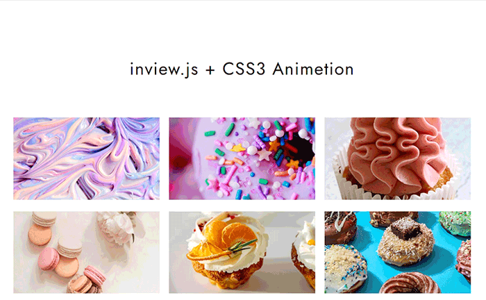
ちょっとおしゃれなサイトでよくみるスクロールアニメーションをinview.jsを使って簡単に確実に再現する方法を解説します。
正直「これが やりたかった」という人もおおいのではないでしょうか。
フェードインだけだと少し物足りないなぁ。でもjsのプログラミングとかめんどくさいことはしたくない。という人におすすめです。
CSSをプラスするだけでちょっと格上のアニメーションを演出できます。
inview.jsの基本的な設定は以下で解説していますのでこちらをご覧ください。
ここではinvew.js応用編として付加するCSSアニメーションについて詳しく触れていきます。
完成イメージ
まず完成イメージがこちらになります。
See the Pen inview.js demo by uhaha (@uhaha) on CodePen.
要素自体の座標は動かさず、カーテンを開けるように表示されていくアニメーションをメインに画像の縮小やフェードインなど複数のアニメーションを組み合わせて作成しています。要素自体のスライドインなどとは少し違いますね。
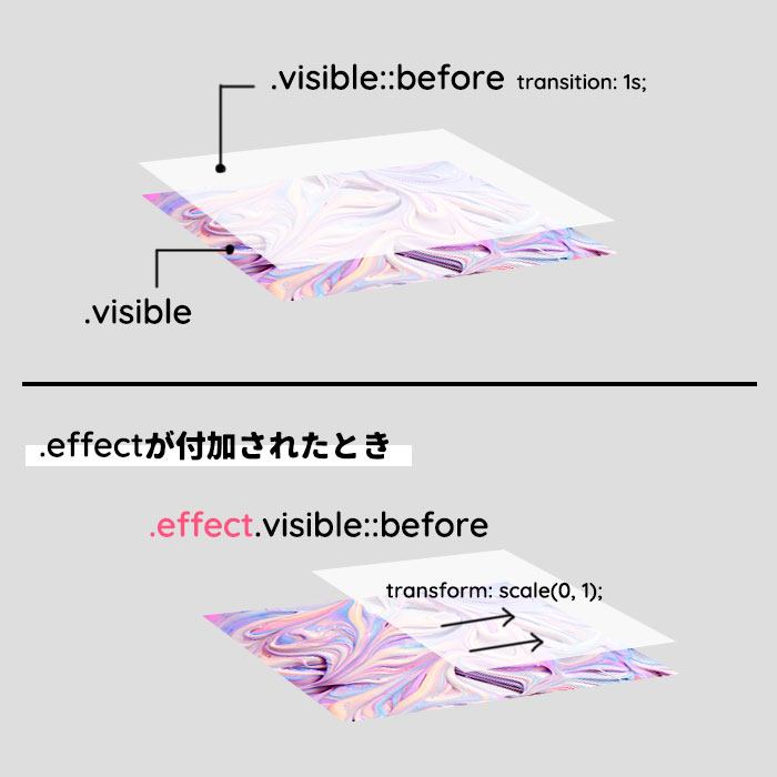
カーテンを開くように表示させるCSSアニメーション

まず上記の様にカーテンを開くように出現させるアニメーションを作成します。画像の上に乗った要素をスライドして画像を出現させるようにCSSのトランジション効果を使います。
HTML
スクロールアニメーションを設定する要素にvisibleを設定します。
<div class="wrap_img visible">
    <img src="img/img01.jpg" alt="">
</div><!-- wrap_img -->
JS
スクロールがビューポートに入ったら.visibleに.effectを追加します。
$(function() {
  $('.visible').on('inview', function(event, isInView) {
    if (isInView) {
        $(this).addClass('effect');
    } else {
        $(this).removeClass('effect');
    }
  });
});CSS(本題!)
画像の上に背景と同じ色の要素を::beforeで乗せておきます。
jsで.effectが付加されたときにscaleXを0にします。
::beforeにあらかじめtransition: 1s;を設定しアニメーションとして稼働させます。
.visible{
    position: relative;
    overflow: hidden;
}
.visible::before{
    content: "";
    position: absolute;
    top: 0;
    left: 0;
    width: 101%; /* 必要なら微調整する */
    height: 100%;
    background: #fff;
    transform-origin: right top;/* アニメーションの軸となる座標 */
    transition: 1s;/* 1秒かけてアニメーションする */
    z-index: 2;
}

.effect.visible::before {
    transform: scale(0, 1);
}
上記をメインに次の過程でもう少しアニメーション演出をプラスしていきます。
要素のスライドアップ&フェードインアニメーション
次に以下のCSSをプラスしてスクロールした際のスライドアップとフェードインのアニメーションを作成します。
.visible{
     position: relative;
     overflow: hidden;
     opacity: 0; /* 初期設定:透明度を0にする */
     transform: translateY(30px); /* 初期設定:30px下に下げる */
}
.visible::before{
     content: "";
     position: absolute;
     top: 0;
     left: 0;
     width: 101%;
     height: 100%;
     background: #000;
     background: rgba(255,255,255,0.7);
     transform-origin: right top;
     transition: 1s;
     z-index: 2;
}
.effect.visible::before {
    transform: scale(1, 0);
}
.effect {
   animation-name: effect_anime; /* アニメーション名 */
   opacity: 1; /* アニメーションが到達した状態 */
   transition: 0.5s; /* 0.5秒かけてアニメーションする */
   transform: translateY(0px); /* アニメーションが到達した状態 */
}
@keyframes effect_anime {
  0% {/* 初期値 */
     opacity: 0;
      transform: translateY(30px);
  }
  100% {/* アニメーションが到達した状態 */
     opacity: 1;
      transform: translateY(0px);
  }
}
アニメーションを開始するタイミングをずらして要素を順番に表示する

上記の様にCSSでトランジション効果が始まるまでの待ち時間を指定することで要素を順番に表示させることができます。
少しの記述で可能なのでオススメです。
.effect:nth-last-of-type(3n-1) {/* 2列目 */
    transition-delay: 0.2s;
}
.effect:nth-last-of-type(3n-2) {/* 3列目 */
    transition-delay: 0.4s;
}
※今回はtransition-delayを使用しましたがanimation-delayを使用する場合もあります。
画像が拡大縮小するアニメーション
最後にスクロールされた際に画像を拡大もしくは縮小しながら表示されるアニメーションを CSSのトランジション効果を使って作成します。
まず画像の囲いとなる.wrap_imgのアスペクト比を固定して画像が拡大されてもずれないようにします。
画像部分は初期設定としてあらかじめscaleで1.5倍にしておいて.effectが付加されたらscaleを1に戻し縮小するアニメーションを作成します。
.wrap_img{/* アスペクト比を固定しておいてく */
     width: 31.333%;
     margin: 0 1% 30px 1%;
  position: relative;
  overflow: hidden;
}
.wrap_img::after {
    content: "";
    display: block;
    padding-top: 56.25%;
}
.wrap_img img {
     animation-name: animation;
     transition: 0.7s;/* 0.7秒かけてアニメーションする */
    transform: scale(1.5);/* 初期設定:1.5倍にしておく */
    max-width: inherit;
     position: absolute;
    top: 50%;
    left: 50%;
}
.effect.wrap_img img {
    transform: scale(1.0);/* 初期設定:1.5倍にしておく */
}仕上げに透明度を調整したり、画像と文字列でトランジション効果の方向を変えたり、微調整します。
.visible{
    position: relative;
    overflow: hidden;
    opacity: 0;
    transform: translateY(30px);
}
.visible::before{
    content: "";
    position: absolute;
    top: 0;
    left: 0;
    width: 101%;
    height: 100%;
    background: #000;
    background: rgba(255,255,255,0.7);
    transform-origin: right top;
    transition: 1s;
    z-index: 2;
}
.effect.visible::before {
    transform: scale(1, 0);
}
.effect {
  animation-name: effect_anime;
  opacity: 1;
  transition: 0.5s;
  transform: translateY(0px);
}
.effect:nth-last-of-type(3n-1) {
    transition-delay: 0.2s;
}
.effect:nth-last-of-type(3n-2) {
    transition-delay: 0.4s;
}
@keyframes effect_anime {
  0% {
    opacity: 0;
    transform: translateY(30px);
  }
  100% {
    opacity: 1;
    transform: translateY(0px);
  }
}
.wrap_img::after {
    content: "";
    display: block;
    padding-top: 56.25%;
}
.wrap_img img {
    animation-name: animation;
    transition: 0.7s;
    max-width: inherit;
    position: absolute;
    top: 50%;
    left: 50%;
    transform: translate(-50%, -50%) scale(1.5);
}
.effect.wrap_img img {
    transform: translate(-50%, -50%) scale(1.0);
}
まとめ
今回のようなスクロールアニメーションは一見複雑にみえるのですがCSSの組み合わせを工夫すればGSAPを使用しなくてもそれっぽく演出することができます。
また、CSSアニメーションといえばanimation-nameを設定して@keyframesを使うーーといったイメージが強かったのですが、transformのscaleといったトランジション効果が意外とつかえます。
プログラミングの知識がなくても簡単にできるのでフェードインやスライドイン アニメーションに飽きたデザイナーさんにおすすめの方法です。

もう当分これでいいですw
【inview.js】スクロールしたらふわっと表示されるCSSアニメーションにfilterをプラスして演出みよう
今回はスクロール表示の際にイベントを発生させるプラグイン「inview.js」と画像フィルターCSS(filter)を使用してスクロールしたときのアニメーションを作成していきます。
inview.jsについて
inview.jsは古参jQueryプラグインです。
1.0.0verだと機能しない可能性があるので注意が必要です。
jqueryバージョン3に対してinview.jsは以下のバージョンを使用することをお勧めします。
CDNでの読み込み
以下CDNのURLになります。
protonet-jquery.inviewのCDN
<script src="https://cdnjs.cloudflare.com/ajax/libs/jquery/3.6.0/jquery.min.js"></script>
<script src="https://cdnjs.cloudflare.com/ajax/libs/protonet-jquery.inview/1.1.2/jquery.inview.min.js"></script>
ダウンロード
以下GitHubページのCodeボタンのDownloadZipよりダウンロードしjquery.inview.jsもしくは jquery.inview.min.jsを読み込みます。
GitHub-protonet / jquery.inview
<script src="js/jquery-3.5.1.min.js"></script>
<script src="js/jquery.inview.min.js"></script>
inview.jsの設定
スクロールするとふわっとフェードインする演出にプラスして今回は同時にCSSで明度でも演出するアニメーションを作成します。
HTMLでクラス付与
スクロールアニメーションをつける要素にクラスvisibleを付与しておきます。
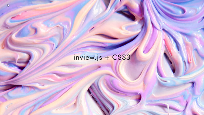
<section class="img01 visible">
<h1 class="tit_top">inview.js + CSS3</h1>
</section>
<section class="img02 visible">
<h1 class="tit_top">SECTION02</h1>
</section>
<section class="img03 visible">
<h1 class="tit_top">SECTION03</h1>
</section>CSSアニメーション設定
.visibleでアニメーション前の初期設定( 透明度0など )をします。
.effectで透明度0、明度300%から透明度1、明度100%に戻すアニメーションCSSを作成します。
.visible {
  opacity: 0;
  transition: transform 0.5s linear;
  animation-duration: 2.5s;
  animation-fill-mode: both;
}
/* brightness */
.effect {
  animation-name: imgbrightness;
  opacity: 1;
  transition: .8s;
}
@keyframes imgbrightness {
  0% {
    opacity: 0;
    filter: brightness(300%);
    /* 明度300% */
  }
  100% {
    opacity: 1;
    filter: brightness(100%);
    /* 100%が基準値 */
  }
}
JSの設定
スクロールした際 、.visibleがビューポートに入った場合上記で設定したCSSアニメーション(.effect)を付加し、ビューポートから抜けた場合は上記のCSSアニメーション (.effect)を削除します。
<script>
$(function() {
  $('.visible').on('inview', function(event, isInView) {
  //一度のみのinviewの際は .oneにする
    if (isInView) {
        // .visibleがビューポートに入った場合
        $(this).addClass('effect');
    } else {
        // .visibleがビューポートにから抜けた場合
        $(this).removeClass('effect');
    }
    //$('#footer').off('inview');
  });
});
</script>
一度のみのスクロールイベント発生にしたい場合は以下の様に.onを.oneに変更します。
$(function() {
  $('.visible').one('inview', function(event, isInView) {
  //一度のみのinviewの際は .oneにする
  });
});
inviewイベントを発生させたくない要素には以下の様に指定します。
$('#footer').off('inview');サンプルデモ
See the Pen inview Elementary by uhaha (@uhaha) on CodePen.
CSSフィルターを以下の様に色相の調整に変更するとまた違ったエフェクトがかかります。
.effect_hue-rotate {
  animation-name: imghue-rotate;
  opacity: 1;
  transition: .8s;
}
@keyframes imghue-rotate {
  0% {
    opacity: 0;
    filter: hue-rotate(90deg)
    /* ここで調整 */
  }
  50% {
    opacity: 0.5;
    filter: hue-rotate(180deg)
  }
  100% {
    opacity: 1;
    filter: hue-rotate(0deg)
    /* 0degが基準値 */
  }
}
See the Pen inview Elementary2 by uhaha (@uhaha) on CodePen.
まとめ
inview.jsは手軽に簡単なアニメーションを付加するのに最適です。
animate.cssのCSSも簡単に使用できるしスクロールアニメーションにそこまでこだわった動きを必要としない場合はinview.jsで十分演出できると思いました。
ブラーなどCSSアニメーション次第でいろいろできますね。